Chiwawa Magazine
Process
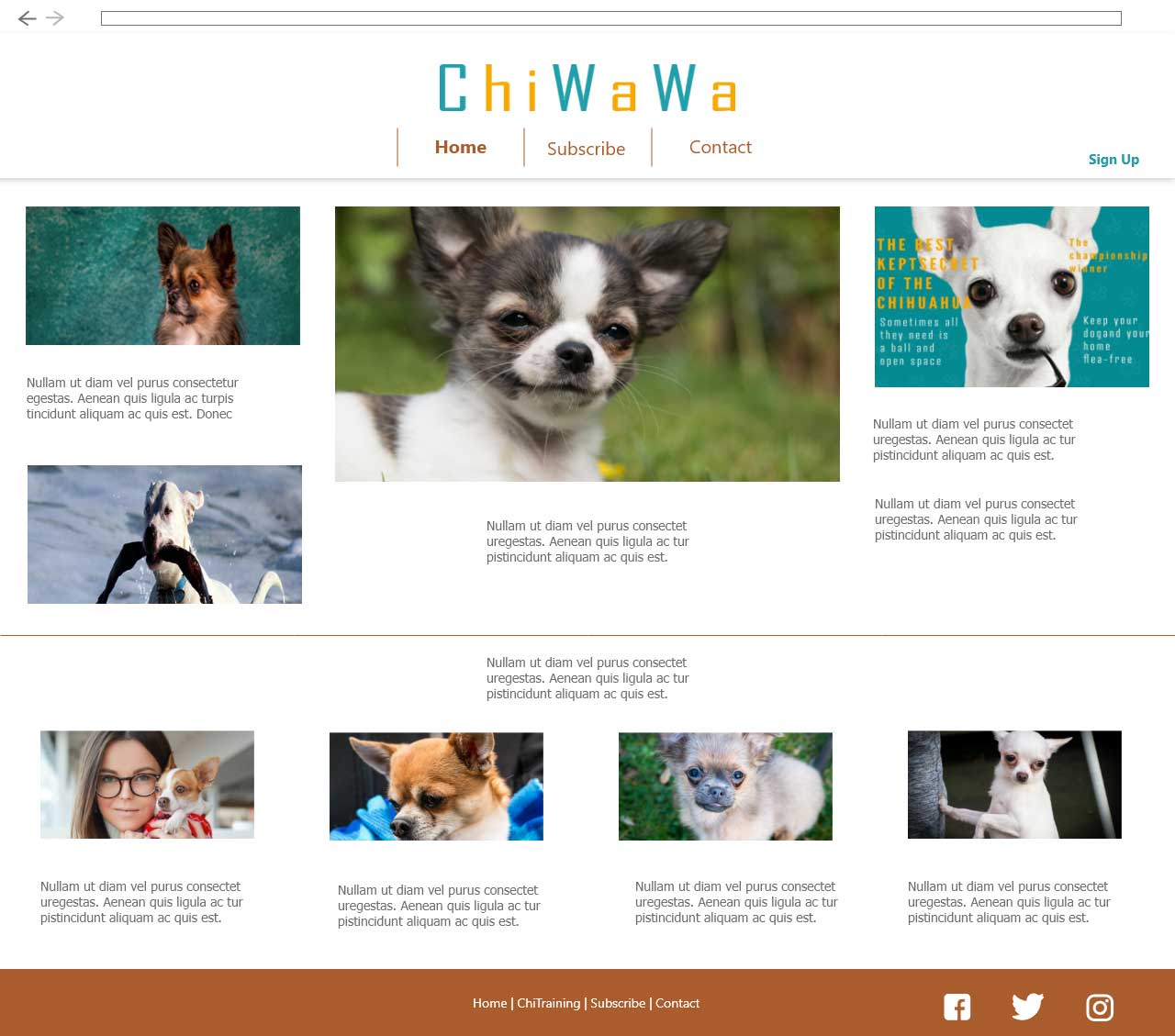
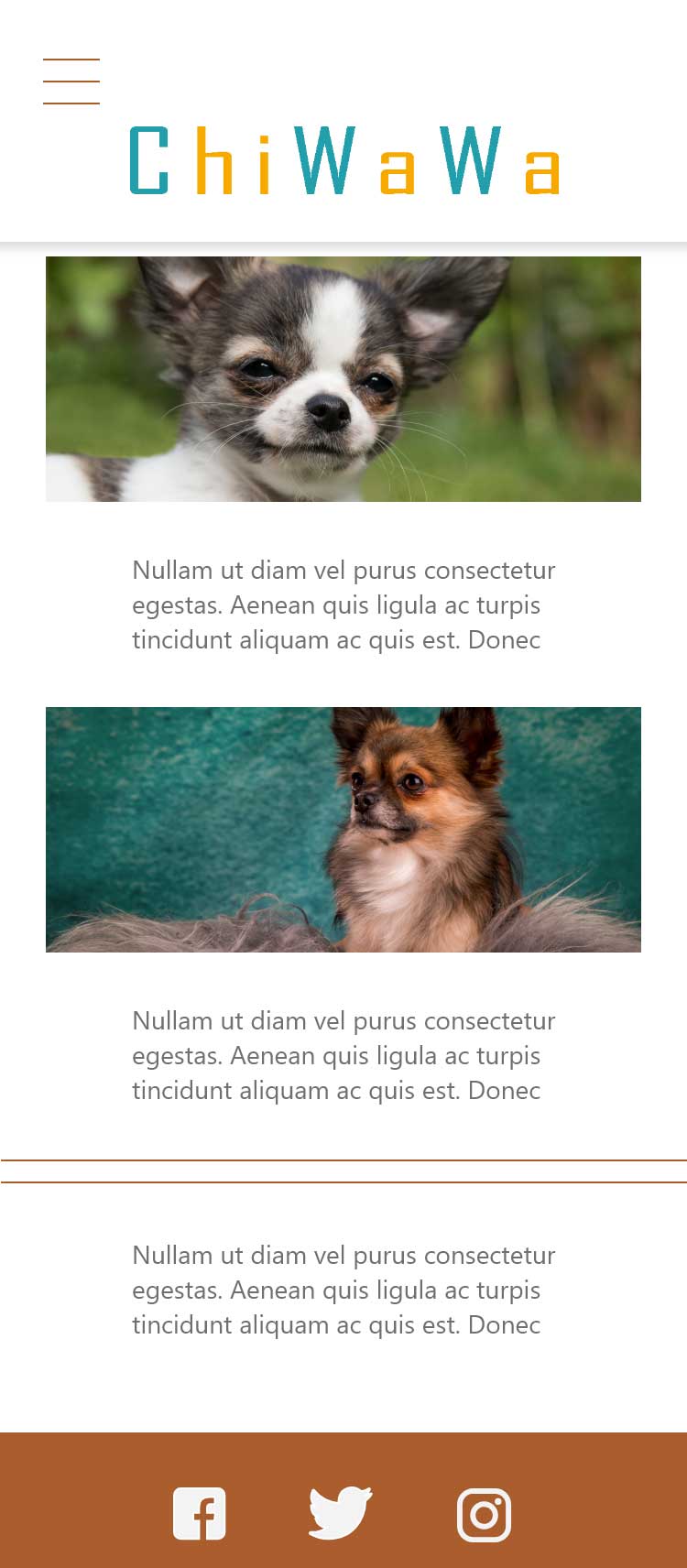
The idea is to have a clean and dynamic magazine style layout. Easier navigating the site and having the some feel of print magazines. All stories having a thumbnail that will break stories in blocks. Also employing little headlines on its own. The mixture of these does not loose the appeal of the site
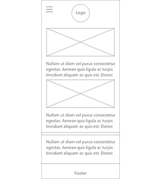
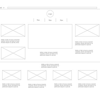
Information Architecture - Wireframe
I created a low fidelity copy of the wireframe. This helps to decide the layout without putting much emphasis on the colors. I am able to focus on the process rather than aesthetics.
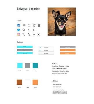
Information Architecture - Color/Styleguide
The client wanted a color that identifies their brand. I chose same colors to match the feel of the site. And I mix it with neutral colors to reduce over empowering the visitor. I created a style guide to give me consistency. It served as a guide on what needs to be included such as credibility and accessibility.
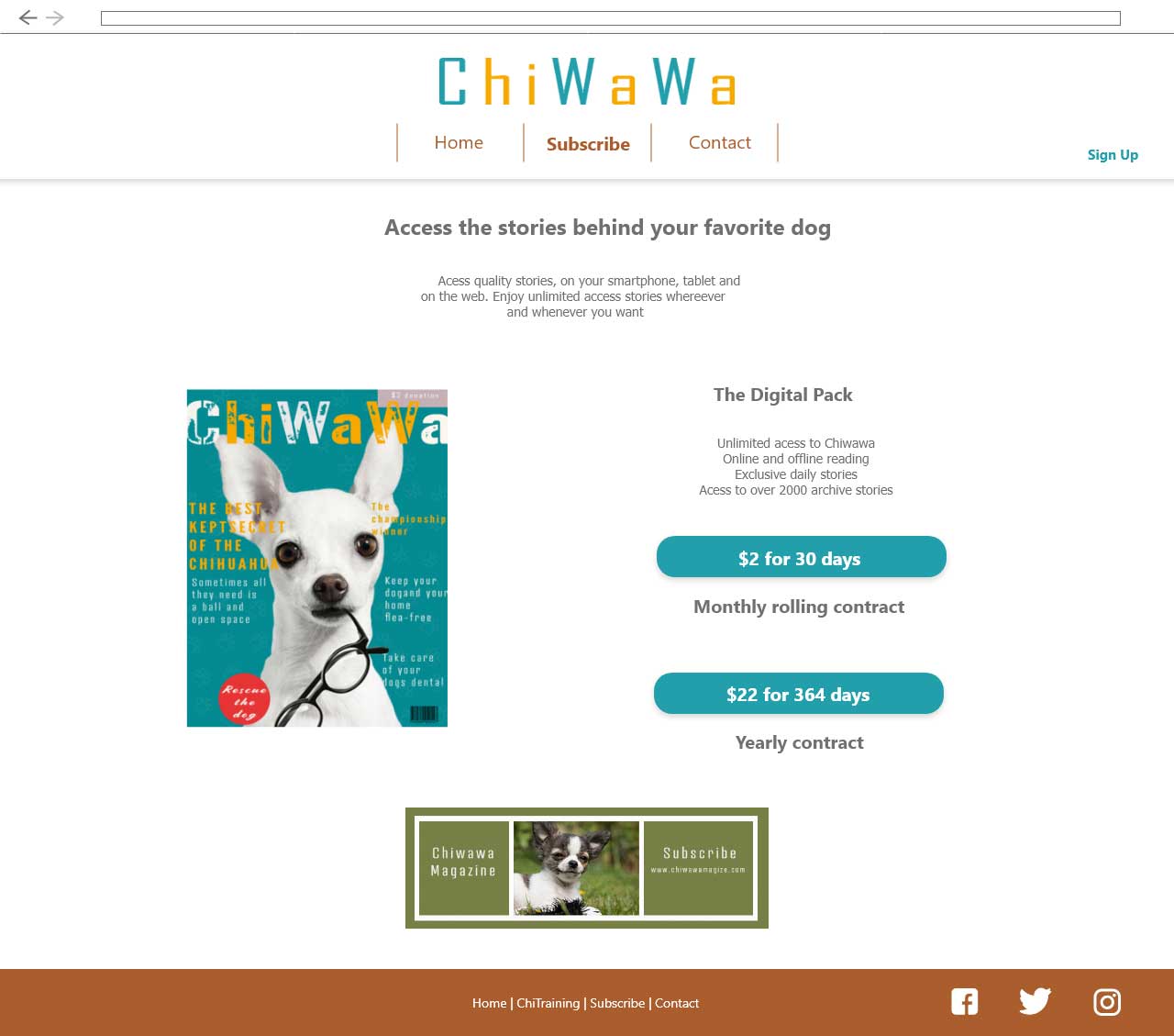
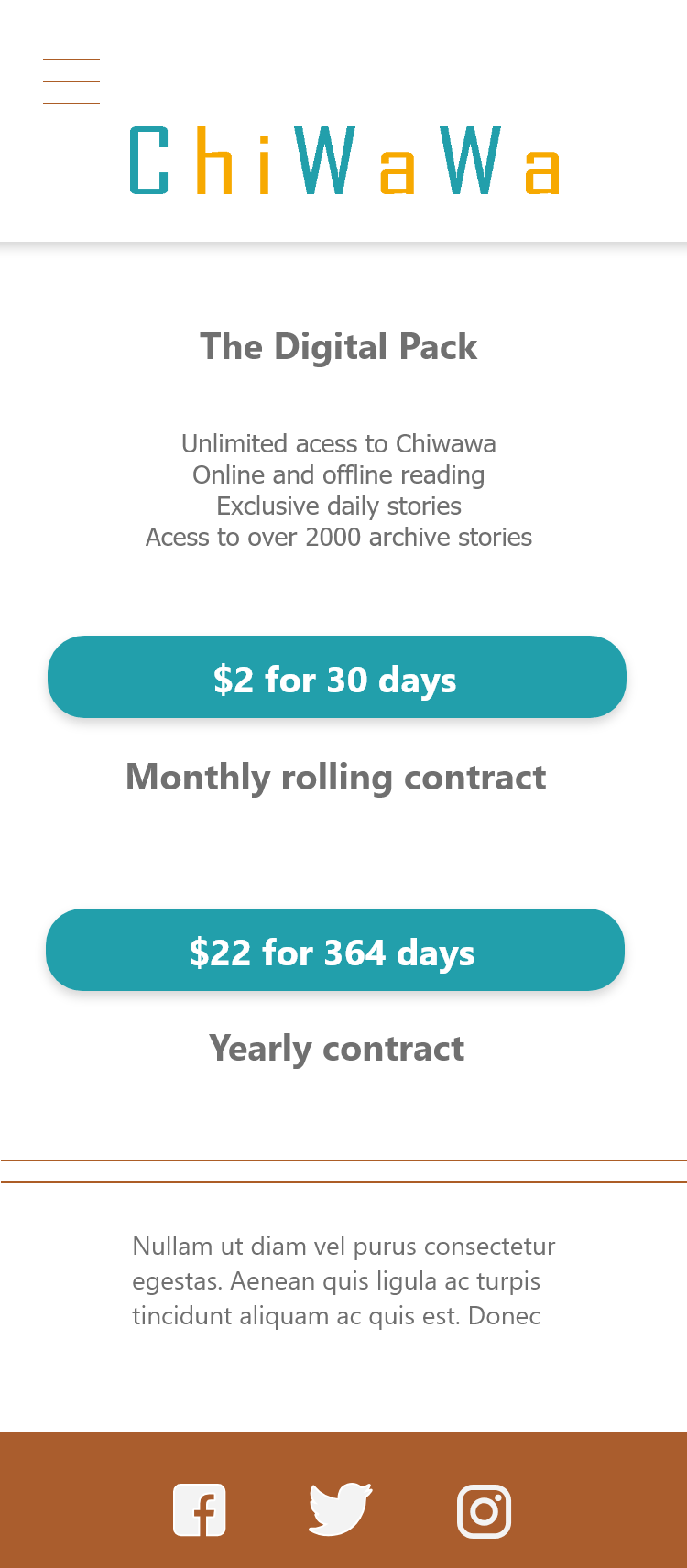
Final - Mockups
